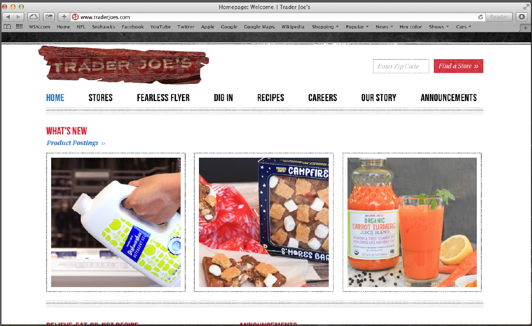
rebranding Trader Joe's Website
Rebranding for Trader Joe's. This was for a class.
Rebranding for Trader Joe's. This was for a class.

This was a layout project where we learned about columns and how to use them. I went with three columns and four rows for my project and found it interesting to see the difference the layouts could make to the final product.

I redesigned Trader Joe’s logo. I added driftwood to the background to make it look more like it just came from the ocean. I put the new logo on the building, clothes, packages, a can, and other items. I worked with Photoshop and InDesign to complete this project. I increased my knowledge by adding the logo to the items.

I designed a webpage for someone who wanted to join a cooking webpage and be part of a cooking group. I made one page work as a live cooking group webpage. The other four pages aren’t, but they are linked to the live page. I had to design a login page and a page with cooking ideas. I also designed a page where you can put what kinds of food you like and what kinds of food you dislike.

For a class project I designed a step-by-step guide to build a snowman. For the step project I decided to make a small book. That way you could go outside with your little book in your pocket and make your own snowman where ever you wanted. The book is also laminated so you can take it outside in any kind of weather. The book will have a ring at the top, so you can flip the pages as you building your snowman. Each step is laid out in the book. I used to make snowmen when I was younger, so I thought someone who has never made a snowman could enjoy making one. They are not hard to make. They are also fun to make with your family, friend or alone. The best part of making a snowman is that you can make it look anyway you want such as happy, sad, tall, or fat, just use your imagination.

I had to draw out shapes, so I could convert them into letters. I enjoyed this project and always wanted to know how to make your own type. After making my letters shapes and putting my letters together, I brought the letters into a software program and from that program you get a working font.
I customer come into the Big Frog of Clearwater to make a custom shirt for his bachelor weekend in Las Vegas. He came in with a list and we went over different kinds of font before we found the correct one.
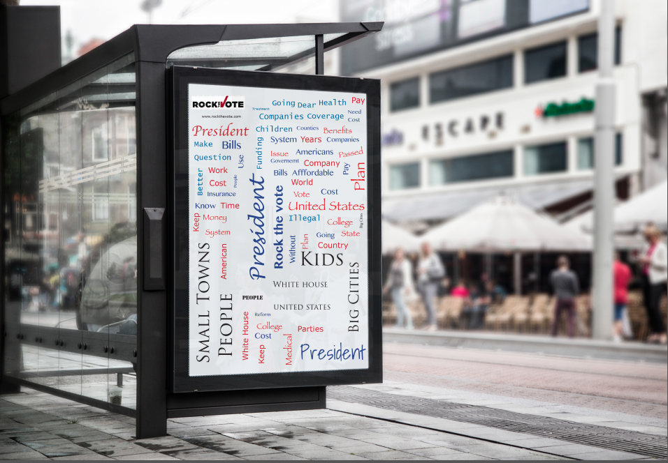
For Rock The Vote I made three different sizes for the poster with three different fonts and three different colors. My colors were red and blue, but I used two different colors of red. The poster is trying to tell you to go out and vote without being in your face about going out to vote. The words are all over the page.

We were to redesign a label or we could pick anything that we wanted to design. First, I designed a little box for all of my spices, but after I finished the project I decided that a label would be better for the spices than a box. I liked the boxed idea for the spices, but you do not really find spices in a box.
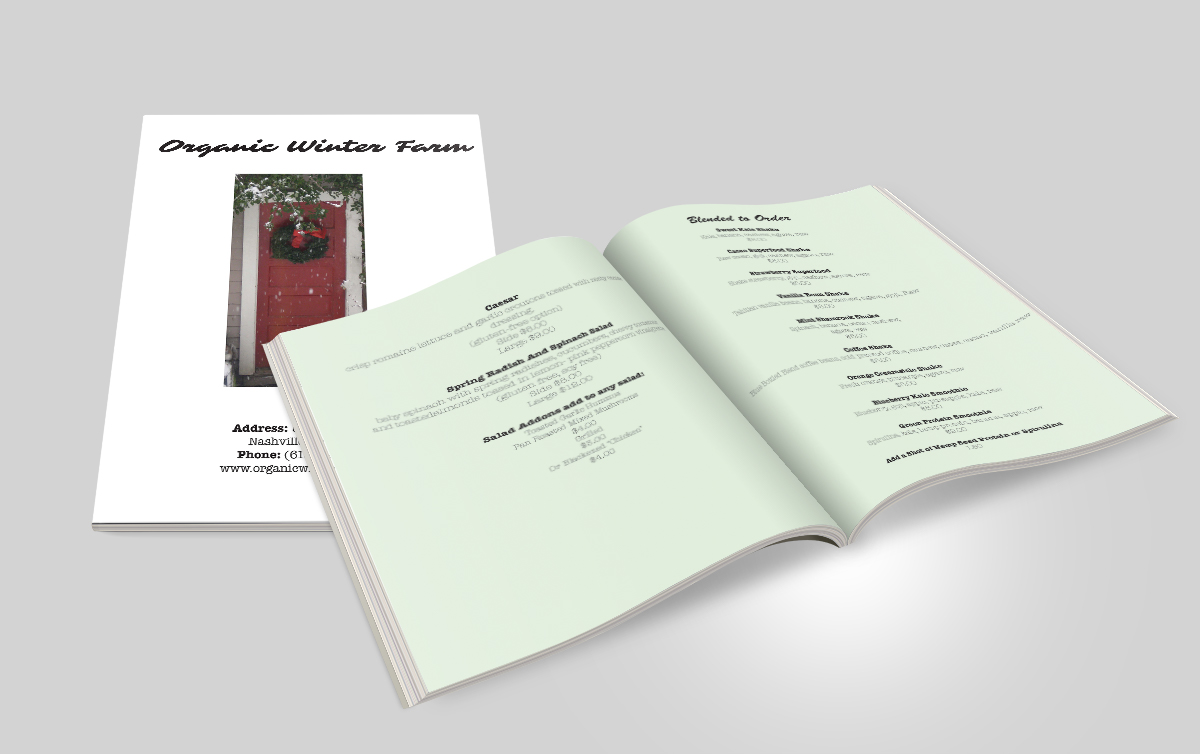
This is another project where I learned a lot. We received a word document that has three different kinds of food. From those three food groups we had to pick one type of food. We had to come up with the name and design for the menu and how we are going to layout the menu. I decided to go with the organic menu. I wanted to stick with something that I was familiar with. I wanted my menu to have some green because every time I think of organic I always think of the color green.
Pop up vent shirt.

I wanted to design a new label that you would not see in store and that people would be surprised to see when they picked up the chocolate bar. I designed three different candy bar labels. I learned a lot from this candy bar project including that food rules are complicated. There is a lot of information that needs to on the label. The type has to be one size and it has to be in one kind of font family. The nutrition facts, UPC code and what was in the bar all had to be on one side of the bar. We had to come up with the color and the name we were going to call the bar and what kind of flavors the bars were going to be and how we were going to design the bar and pick a font family for the bar.

I was to design a book that had less then 500 words and was only four pages. We could pick song lyrics, a short story or poems. We were to use only one font, but it had to have more then two styles in the font family. I picked a long one that I was into and I knew it had less then 500 words. I broke the song down into four different parts and each part of the song is on its own page. Each page is different in some way, from the color that has been used, to the background color, to the way the type is used, and from the spacing and leading. It is hard to only use one type and only use the fonts that come with the family. I used Chaparral Pro, which has five different styles of font in its family. In Chaparral Pro you have regular, italic, light italic, bold, and bold italic. It is also, difficult to stick to one font family, but I was allowed to use the font however I pleased. I picked “We Were Us” by Keith Urban featuring Miranda Lambert. It is a country song.